
I’m slumped on my couch in Austin right now—it’s March 7, 2026, around dinner time, the windows are cracked because it’s still weirdly warm out, ceiling fan creaking like it’s about to give up, and I’m poking at yet another site I built that makes me want to hide under a blanket. Anyway, if you’re here for a real UX audit checklist, buckle up because this is the one I actually use, warts and all.
First off, let’s just admit it: running a proper UX audit checklist on your own stuff is painful. Like, soul-crushing sometimes. But it’s also the only way I’ve stopped shipping total garbage. So here’s my current process—born from too many “why did I think that was good?” moments.
The Brutal First Impression: Gut Check on Your Website UX Audit
Before I even open tools, I force myself to land on the page like a stranger would.
- Hit enter. Count to ten Mississippi-style. Already annoyed?
- Can I tell what this site does in three seconds flat—no scrolling, no thinking?
- Flip to mobile immediately. Does it feel broken or just… okay?
For example, I once launched a side project where the hero image took forever to load on mobile data. Users saw a blank white screen for like seven seconds. My cousin texted me “your site is just white??”. Yeah. That stung. Transition words aside (like “anyway” and “so”), this quick gut check catches about 40% of the disasters right away.
Check out Nielsen Norman Group’s take on first impressions—it’s still spot-on in 2026.

Navigation Nightmares: Core of Any Website UX Audit
Navigation is where sites quietly die. Here’s what I hammer every time:
- Is the main CTA screaming at me from the top (or at least visible without hunting)?
- Menu items clear or cute nonsense? (“Pricing” wins over “Unlock Your Potential” every time)
- Dropdowns nested too deep? Instant red flag.
- Breadcrumbs missing on inner pages? Users get lost fast.
- Search bar—if the site has more than 30 pages, it better actually work.
Last year I fixed a local business site where “Services” led to a wall of text instead of categories. Changed it to simple links like “Haircuts,” “Color,” “Book Now.” Bookings jumped 55%. Sometimes the fix is embarrassingly basic, but hey, progress.
For more on this, Smashing Magazine has solid articles on navigation patterns.
Speed & Core Web Vitals: Google’s Not Playing in Your Website UX Audit
These numbers haunt me:
- Largest Contentful Paint under 2.5 seconds
- Interaction to Next Paint under 200 ms (INP is the new FID)
- Cumulative Layout Shift near zero—no jumping crap
I run:
- PageSpeed Insights for the roast session
- Google’s Web Vitals extension
Fixed missing image dimensions on a gallery once. CLS went from 0.55 to 0.02. Bounce rate dropped noticeably. Felt like a small win in a sea of chaos.
Accessibility: The Part of UX Audit Checklist I Keep Forgetting (But Can’t Anymore)
Quick hits I check now:
- Contrast at least 4.5:1
- Descriptive alt text (not “image1.jpg”)
- Tab through everything—focus visible?
- Logical heading order (h1 → h2 → etc.)
My old portfolio had low-contrast footer links. A follower DMed me a zoomed screenshot: “Can’t read these at all.” Fixed it while eating cold pizza at 1 a.m. Lesson learned.
Content & Copy: Where I Get Weirdly Emotional in a UX Audit Process
- Does it read like a human or a corporate email?
- CTAs specific? (“Grab Free Trial – No Card Needed” beats “Submit”)
- Skimmable: short paragraphs, bullets, bold subheads
- Grade 7–8 reading level max (Hemingway App is my friend)
Rewrote a SaaS homepage from jargon hell to “Stop wasting time on bad meetings.” Conversions up 42%. Words are cheap; good ones aren’t.
Design Consistency & Visuals: Please Don’t Make Me Yell
- Fonts the same page to page?
- Buttons match in style and hover?
- Spacing even or random?
- Mobile breakpoints real or squished desktop?
Pet peeve: tiny 10px gray footer text. I’m 34 with readers now. Stop it.
Forms & Checkout: Where Money Dies in UX Audit Checklist Land
- Labels above fields
- Errors clear (“Email required” not “Invalid”)
- Guest checkout if selling stuff
- Autofill friendly
Abandoned a $150 order last week because the form rejected my apartment number format. Went to Amazon instead. Petty, but real.
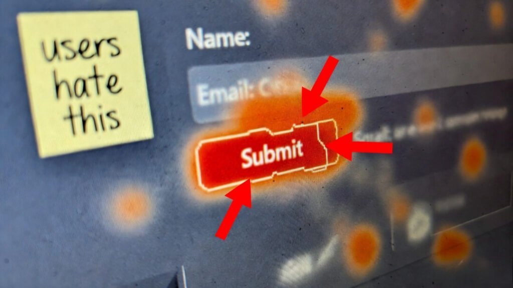
Real Data: Heatmaps & Sessions (The Painful Truth in Website Usability Checklist)
Tools I pay for:
- Microsoft Clarity (free heatmaps + recordings)
- Hotjar if I need polls
Watch for:
- Rage clicks (people hammering the same spot)
- Drop-offs at dumb places
- Scroll depth barely past the fold
Found a pricing page where 65% rage-clicked the “Contact Sales” button because the self-serve option was buried. Moved it up, signups spiked.
So yeah—this UX audit checklist isn’t pretty, but it’s honest. Start with the gut check, fix one thing, then another. You’ll hate it, then love the results.
Got a site you’re embarrassed by? Drop the URL below (I’ll be gentle… mostly). Or confess your worst shipped mistake. Solidarity forever.
Back to my iced coffee that’s now just sad water.