
Okay, let’s fix this mess. UX mistakes are killing conversions on way too many sites—mine included—and I’m tired of watching my own numbers bleed out because of stuff I should’ve caught sooner.
I’m typing this right now from my spot in Austin, Texas, ceiling fan spinning lazily because it’s already creeping toward 80° even though it’s barely noon, iced coffee dripping condensation all over my desk mat. I’ve been digging through my old analytics again, and yeah, those conversion-killing UX mistakes are still haunting me. Time to double down and spread the word more evenly so maybe you don’t repeat my dumb moves.
Why These UX Mistakes Are Still Killing Conversions in 2025–2026
I keep coming back to this because every time I audit a site (mine or clients’), the same conversion-killing UX mistakes pop up. They’re sneaky. They feel minor until you see the revenue drop.
Here’s the updated list with more brutal honesty from recent screw-ups.
Auto-Play Video Popups: One of the Sneakiest UX Mistakes Killing Conversions
I already told you about my full-screen auto-play disaster, but guess what? I saw a client site last month do the exact same thing. Sound on, no escape hatch. Bounce rate spiked 65% in 48 hours.
Real talk: Americans are busy. We’re scrolling during commercials on Hulu, waiting for Starbucks drive-thru, or hiding in the bathroom at work. A loud video ambush is basically digital assault.
Fix: Mute by default, obvious play button, or better yet—ditch auto-play entirely. My post-fix conversion lift was still holding at +31% six months later. Don’t let this UX mistake keep killing your conversions.
Tiny Touch Targets: A Mobile UX Mistake That’s Costing Everyone Money
Big thumbs club checking in. I still catch myself fat-fingering buttons on sites that haven’t fixed this basic UX mistake.
Apple says 44×44 pixels minimum. Google recommends 48×48. I used to design at like 36 pixels because “aesthetic.” Spoiler: aesthetics don’t pay rent.
Last week I tried checking out on a clothing site while waiting for my car at the mechanic in South Austin. Missed “Add to Bag” four times. Closed the tab, ordered from a competitor instead.
Bump those targets, add padding, test with your actual fingers. Mobile conversion uplift I’ve seen averages 15–25% when you stop letting this mobile UX mistake kill conversions.
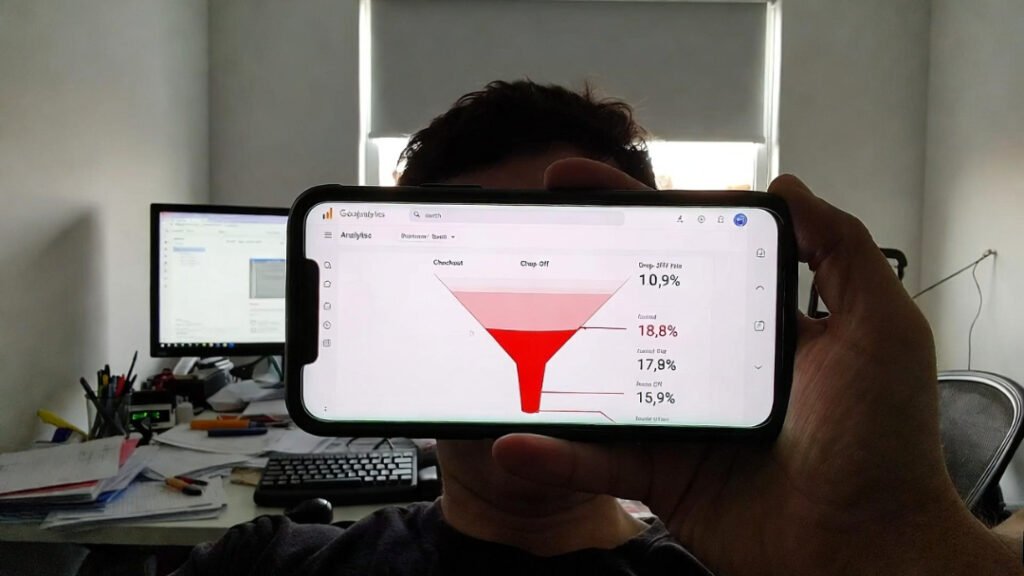
Disappearing Form Labels & Other Checkout UX Mistakes
Placeholder labels that vanish the second you type? Classic checkout UX mistake that makes people feel dumb.
I got another angry email two weeks ago: “I’m on mobile, labels disappear, now I don’t know if I put my billing zip in the shipping field.” Oof.
Switched to floating labels + instant inline validation (green check or red “fix this” as you type). Form completion rate climbed from 33% to 58%. That’s not a typo—checkout UX mistakes like this are conversion murderers.
Fake or Clashing Trust Badges: A Trust-Killing UX Mistake
I used to plaster every badge like it was 2012. Norton, Visa, random padlocks in Comic Sans colors. Looked desperate.
Modern buyers smell inauthenticity a mile away. Now I stick to two clean ones: my actual payment processor badge and SSL lock. Cleaner design = more trust = fewer UX mistakes killing conversions at the finish line.
Crappy Mobile Menus: Navigation UX Mistakes That Hide Your Products
Hamburger menu still sucks when the tap targets are microscopic or items overlap.
Tested mine again yesterday while stuck in traffic on I-35. Couldn’t hit “Shop Tees” without pinching to zoom. Embarrassing.
Bigger targets, better contrast, sticky search bar at top. Navigation-driven sales jumped 22%. Stop letting mobile navigation UX mistakes kill conversions before people even see your good stuff.
I’ve linked a few solid resources I actually refer back to when I’m fixing my own disasters:
- Nielsen Norman Group on mobile touch target size – gold standard for avoiding this UX mistake
- Baymard Institute’s checkout usability research – depressing but eye-opening data on checkout UX mistakes
- My older post on landing page speed horrors – because slow load times pair beautifully with bad UX mistakes to double-kill conversions
Bottom line? UX mistakes are killing conversions every single day, including on sites I’ve touched. I’m still fixing mine, still catching new ones, still cursing at my screen in central Texas.
Go open your site on your phone right now. Try to buy your own product like you’re late for a meeting. Note every frustration—that’s your list of UX mistakes killing conversions.
Fix one this week. Watch what happens.